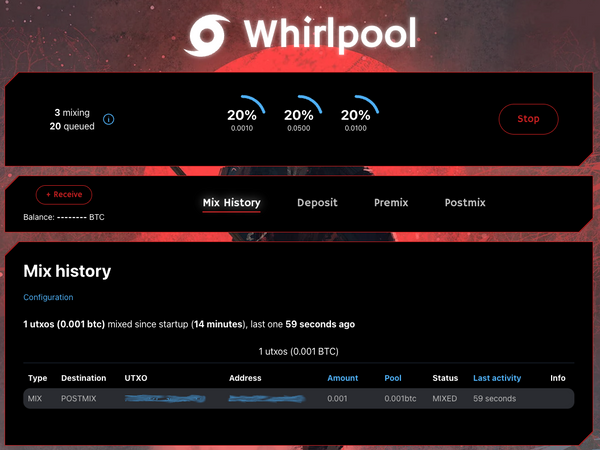
Today, we're very happy to finally share with you what we've been working on for the last few months. This has been a long and insightful journey for us and our vision is finally coming to fruition. Let me take you through some of those insights and introduce you to our baby ‑ RoninUI 2.0.
As you may know, RoninDojo started off as a project for Samourai Wallet users by Samourai Wallet users and it will forever be this way. Our goal always was to help users run their own Dojo on affordable hardware and with as few skills as possible. From the start, we wanted users to have the ability to run their own node,their own Dojo, mix their coins with Whirlpool and use other open‑source tools that would help them be sovereign.
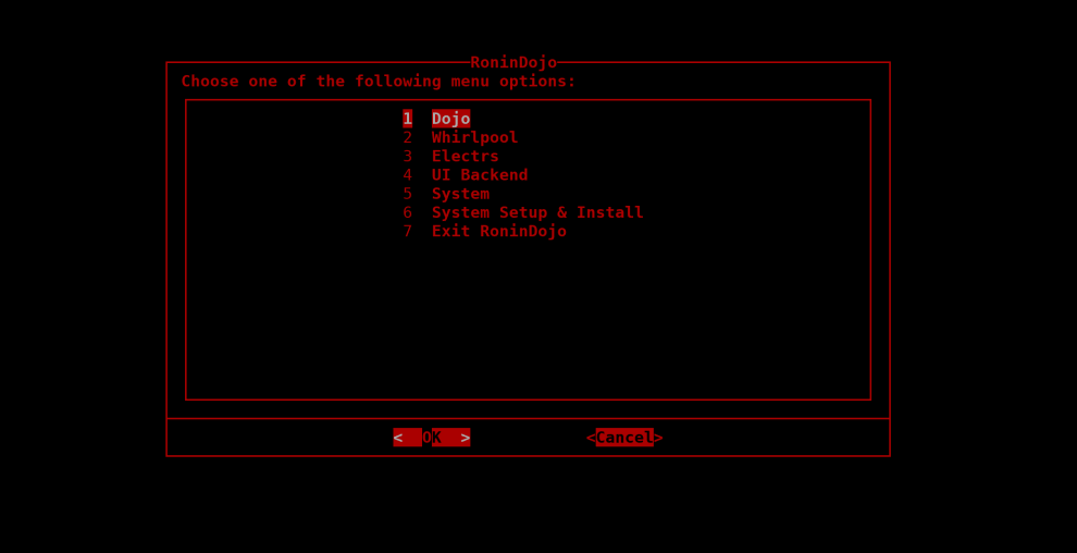
To make things easy forthe users, we introduced a command‑line interface. They wouldn't have to editthe files themselves, everything was operated by shell scripts and users just needed to SSH into the device to interact with the menu. While this was a good first step, we knew we wanted to give our users something more interactive. We have soon realized that we want our users to have an interactive web‑based UI which would be able to incorporate various tools and monitor their RoninDojo vitals in the realtime.
After a couple of months, we have introduced Ronin UI ‑ a brand new way for our users to interact with their RoninDojo. While this was a big step at the time, we knew we would have to step up our game in order to prevail as the go‑to option for Dojo users. We knew that users wanted something more from their interface. Something more than just functionality. Users wanted to have an amazing experience and joy from using such an interface.
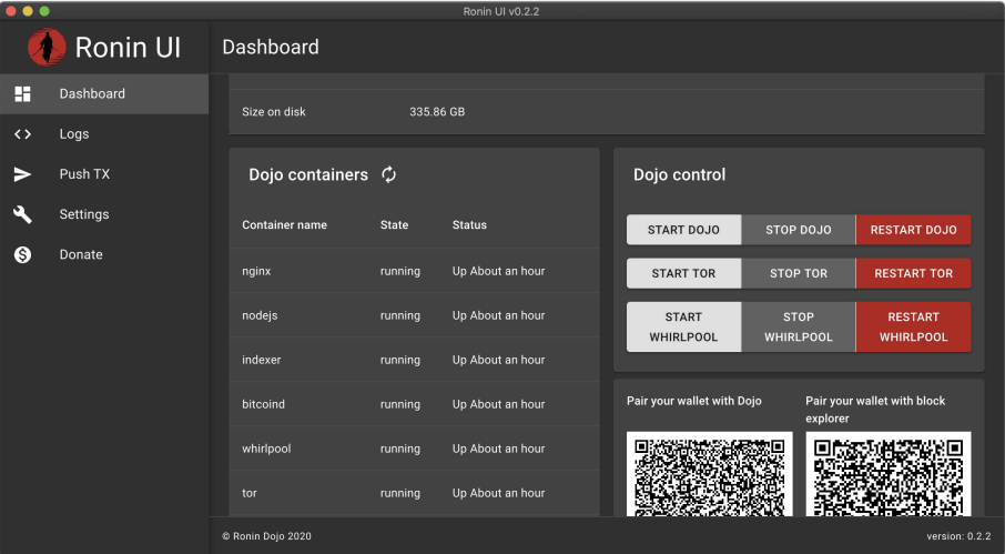
We have started to work on a worthy successor. Our original Ronin UI was a little rough around the edges and we knew that. It had the functionality we wanted but it wasn't quite there. We've concluded that we will need help of some skilled designers ‑ and that's where The Invisible Hand team comes in. They've been able to take existing UI, listen to your needs, added their own feedback and crafted a design that we could present to our users. We are really happy with their work and hope you will be as well.
Once the design was ready, it was time to start implementing everything in order to develop a striking user experience that our users will enjoy to use. But this was not just about the design, care was put into the inner workings as well. Parts were rewritten, new concepts were introduced and that means the users should have a smoother experience. And here's what we deliver...
Enter RoninUI 2.0
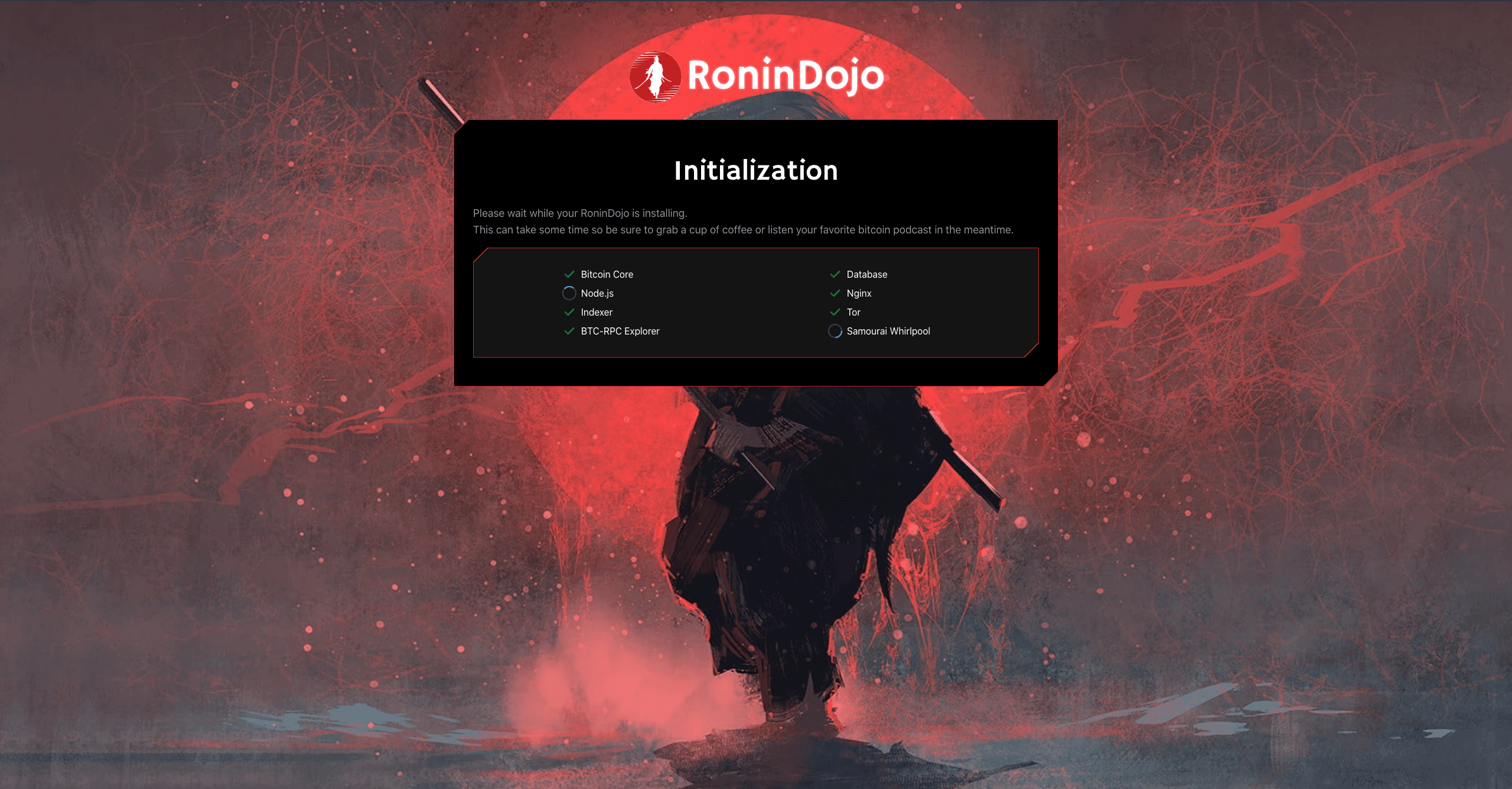
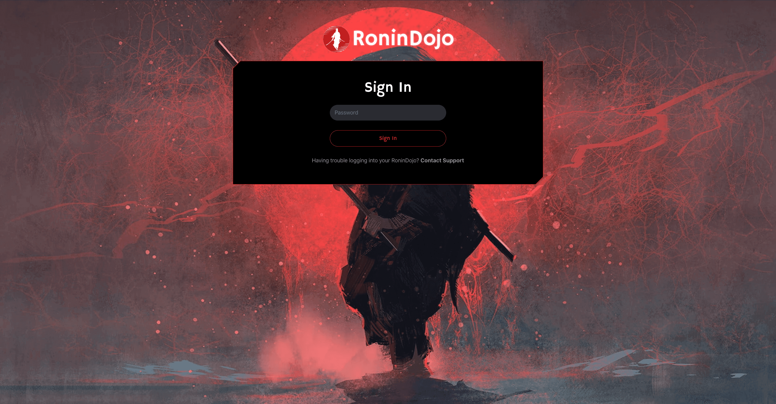
Fast‑forward a few months and here we are. A brand new Ronin UI that was crafted with care and with our new RoninDojo Tanto in mind. This interactive web interface was created with usability and accessibility in mind, as well as stunning user experience and performance. To make it really worth it,this new UI is mobile‑ready and you will be able to use it on your mobile phone while you're on the go.
Let me take you through some of our new screens and features so you get the idea.
When we developed our Tanto, we knew we wanted for our users the most simple way to get started with their node. This means that Tanto users will be able to setup their password and see the progress of their Dojo installation right in their browser ‑ no need to use a terminal and SSH.
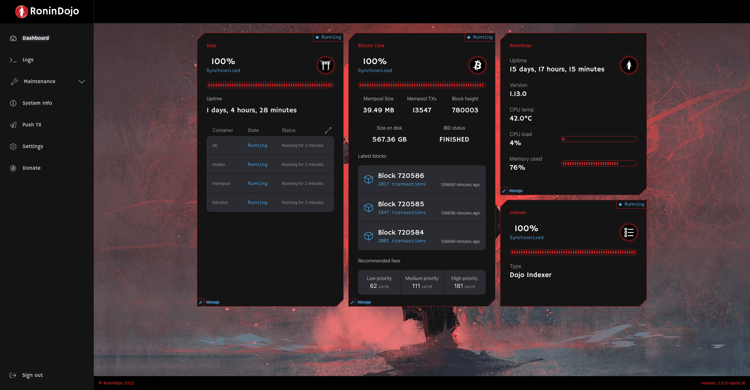
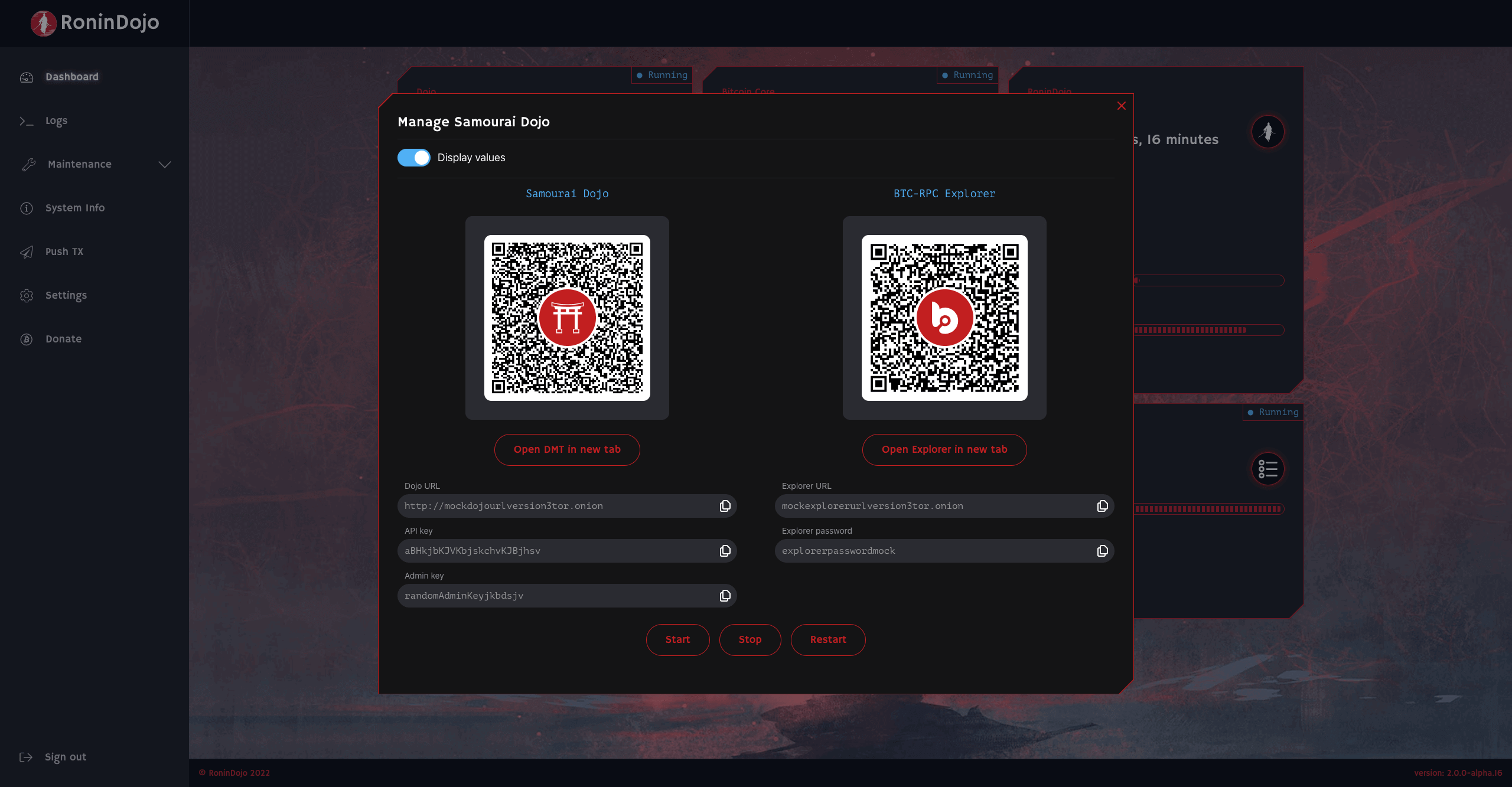
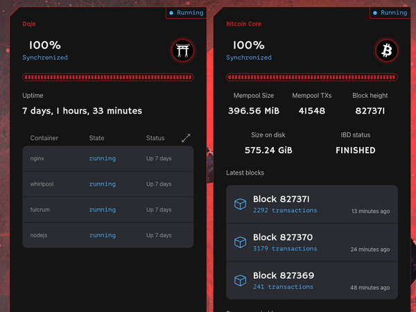
After the initialization users will be greeted by our new Dashboard screen and should be able to see initial block download progress, CPU & memory usage and status of their Dojo synchronization as well as other useful information. Abilities to restart Dojo or the whole device and connect your Samourai Wallet are displayed with a click on the Manage button.
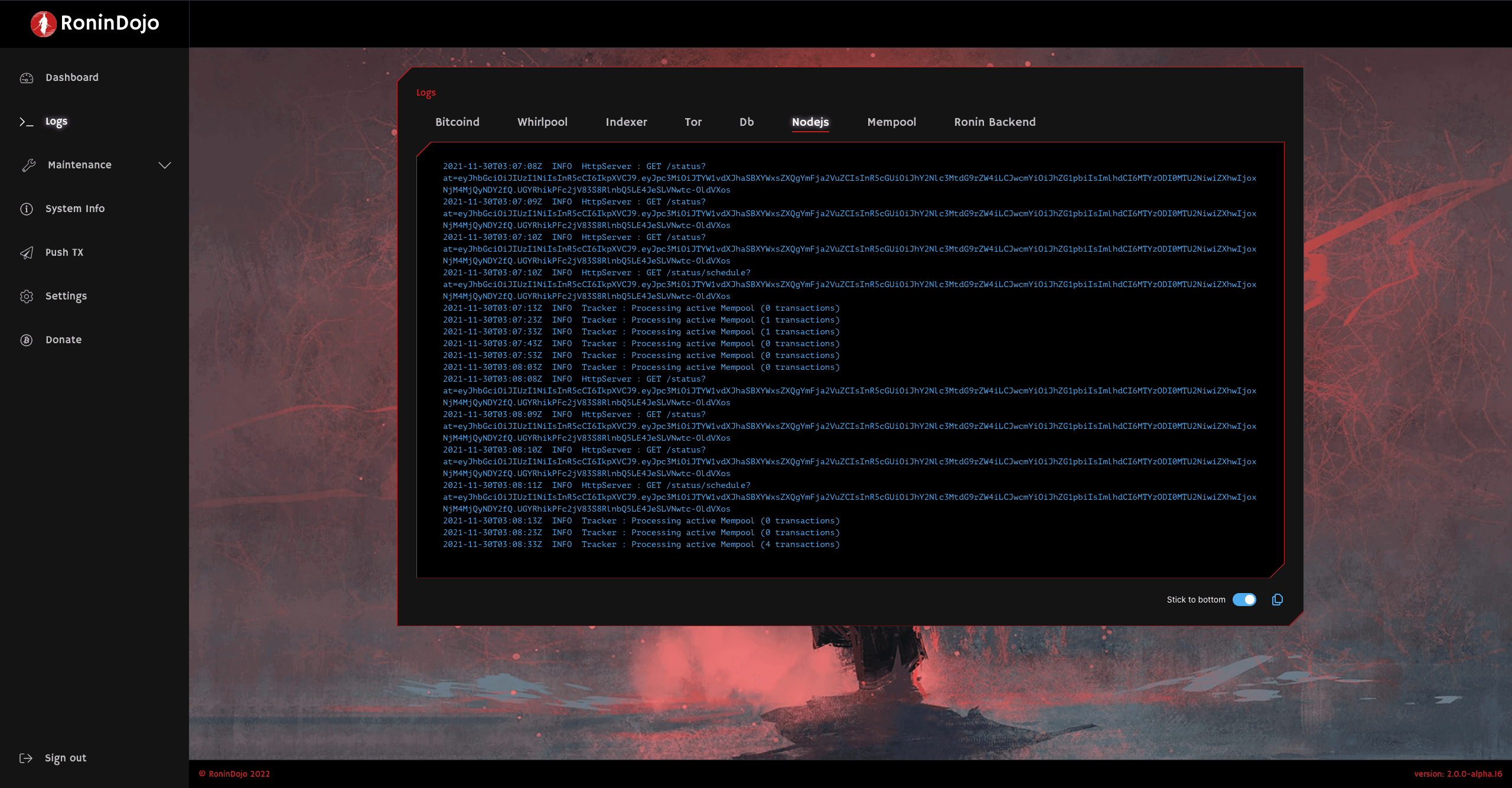
For debugging and monitoring purposes, we have also enhanced our Logs screen. It is now more readable, and with an added ability to toggle log sticking and copying the entire log contents to your clipboard.
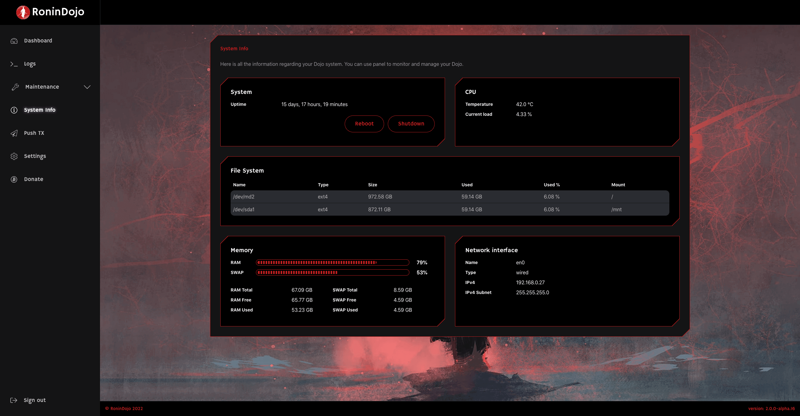
We've also put more care into the System Info page which is now more intuitive and provides users with useful stats about their hardware, as well as ability to reboot or entirely shut down their device.
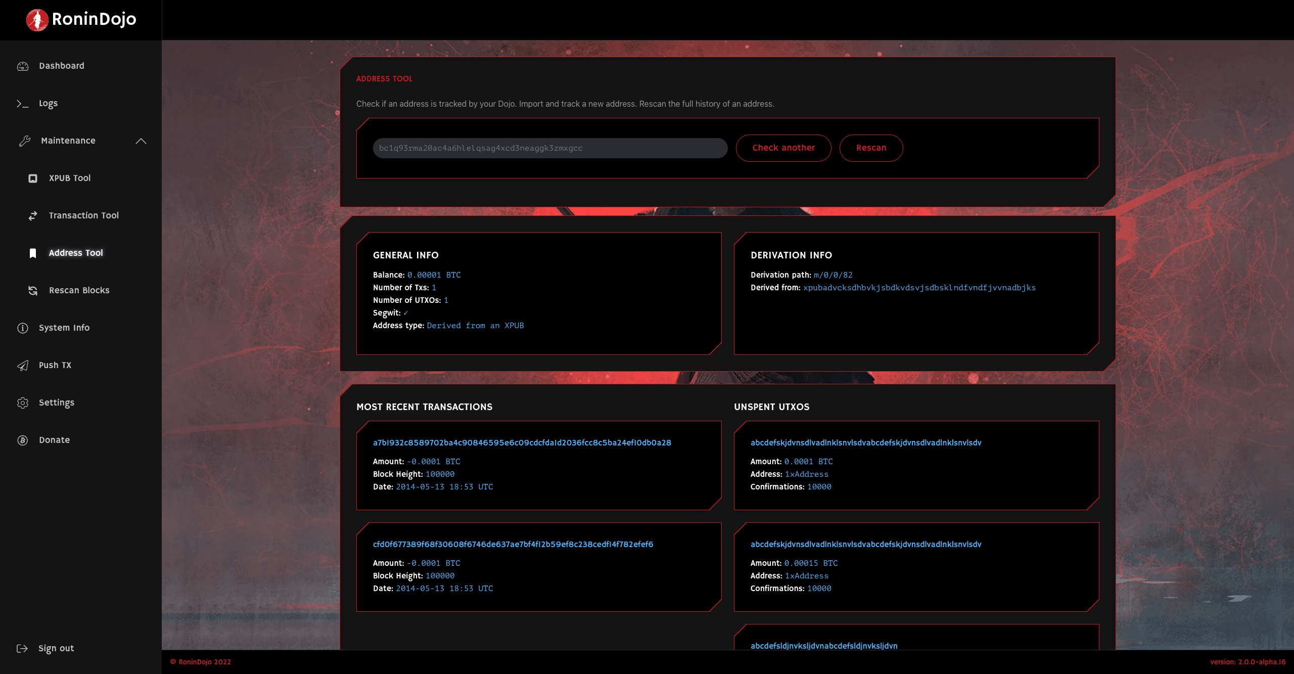
Special treatment was given to our Maintenance Tools. While these tools are a part of the standard Dojo Maintenance Tool, we tried to make them more slick and provide an even better experience and some more information to the user. Ideally, users shouldn't need to have to enter the standard Dojo Maintenance Tool.
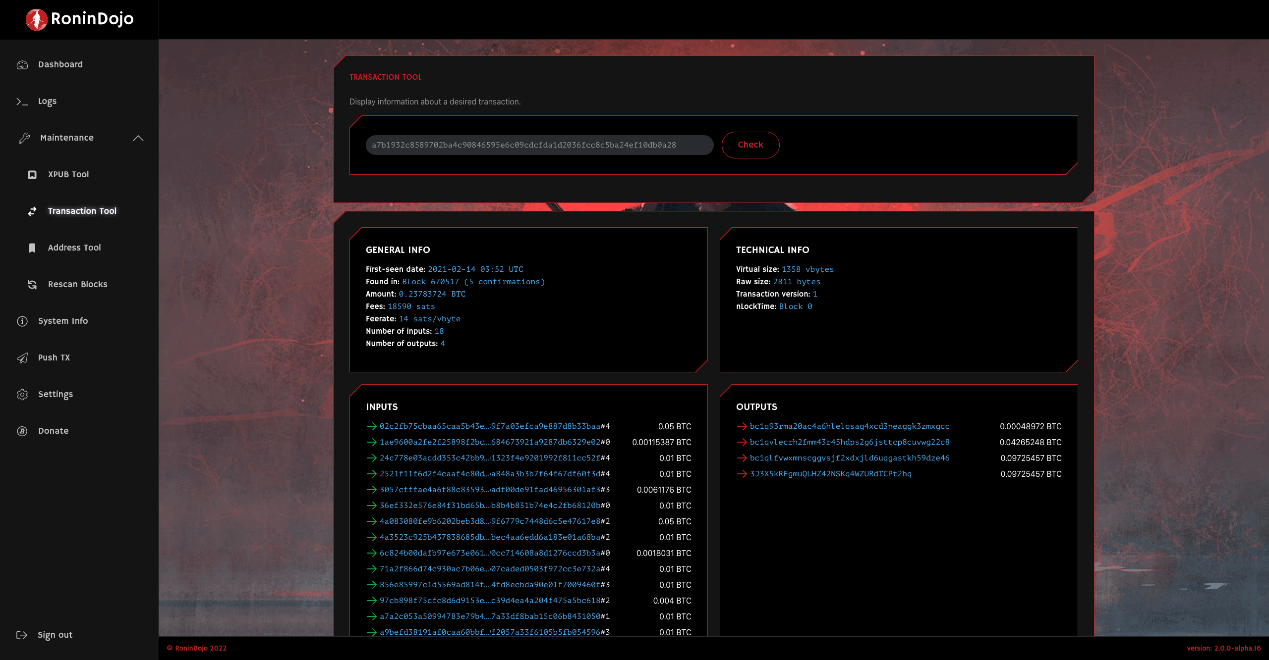
Last but not least,there are some previously introduced features such as ability to publish a raw transaction or open included BTC‑RPC Explorer.
While these are all nice, it's just a beginning and we will continue to add more features in the near future. To name a few: calculate and display a Boltzmann score for any transaction similiar to KYCP.org , install and uninstall certain apps like local Mempool.space, Manage your Whirlpool CLI using Ronin UI or upgrade your RoninDojo and system dependencies via Ronin UI.
One change for our current users is that Ronin UI does not have a separate password anymore ‑ existing installations will now require a user SSH password to sign‑in.
Again, we want to thank all of our users and the whole FOSS community. Our goal always was bringing the best Dojo stack to Samourai Wallet users and you all make this possible. We will continue building.

